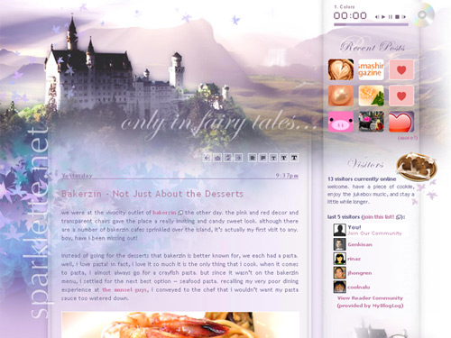
Version 1.11: Only in Fairy Tales…
This is a long overdue site revamp. People have been bugging me for this. I actually conceptualised this layout months ago, but had been too busy (and lazy) to really get it up and running. But now I finally got around to doing it! This is version 11 of Sparklette – only in fairy tales…
I emphasise that this is still work in progress with lots more to be done. Therefore I call this the alpha release. With some more polishing here and there, throwing in a few finishing touches, we would be all set!
Of course, this layout is definitely less colourful and perhaps more gloomy than the previous. I kinda went for an ethereal feel in this fairy tale layout. Why fairy tale? Because only in fairy tales do good things last, and people live happily ever after. The good is rewarded, and evil doesn’t triumph. And since I would never have a fairy tale like existence, this would be the next best thing.
The featured castle is the world famous schloss neuschwanstein in Germany. Certainly one of the top ten places I wanna visit this lifetime. The Disneyland castles actually drew inspiration from this building! The image of the castle was taken from deviantART. Full credits to the artist!
Special thanks go out to chup for helping me with the flash parts that I needed done. The flash jukebox that you guys must be familiar by now was done by him. This time round he has helped me come up with the flying maple leaves, as well as another very subtle effect that I shan’t reveal here. Look out for it!
There is still a lot of work that needs to be done. I have switched my blogging engine to wordpress, which is a fantastic engine and a far cry from greymatter, the problematic engine that I used previously.
changes/improvements in version 11:
- once arriving at Sparklette, visitors can immediately see whether the blog has been updated without having to scroll down.
- visitors can change the font size or font alignment according to their own preference, by clicking on any of the five small buttons above.
- blog entries are now placed under different categories such as food, life, etc.
- a relatively less graphic-intensive layout for non-broadband users.
- food reviews would be more detailed and comprehensive. They would be given their own dedicated blog entries in which I would label the food with my own rating and the restaurant with its address and contact number.
- i built this layout in a 1024×768 screen resolution. In all my previous layouts, I always tried to accommodate the 800×600 users. But as more people are using bigger screens, I decided to make the layout look more visually balanced by designing it in a 1024×768 screen resolution. My apologies to the small screen users.
bugs/problems:
- from this version onwards, I no longer use frames. This means that everytime you click on a link (to the blog entry page for example), you are brought to a new page as seen in the address bar. The jukebox doesn’t load the songs anymore. (can’t be fixed)
- the flying leaves may cause lag in less powerful computers, laptops especially. Once you scroll down, the lag would be gone. (can’t be fixed)
what needs to be added:
- brand new songs to jukebox
- a more complete sidebar
- past layouts page, portfolio, design services
what may be added:
- moblog, also known as a mobile blog where I send in short blogs via sms.
All right that’s all I can think of for now. Please feel free to leave your comments. Thank you, and I hope you like this layout.
Much love,
Veron


Sep 22, 2006
Wow~~~ very mezmerizing!! love it!
Sep 22, 2006
3472
Thanks!
Jun 1, 2007
1
I esli ya odnazhdy zamolch. Oluwafunmilayo Kalev.
Nov 11, 2007
3
Nice work with the design! I like the plugins you’ve used, especially the preview of comments, new visitors get a custom welcome message and the design. Great work…
Mar 3, 2008
1
This is unbelievably gorgeous! The colours are perfect.
Jun 17, 2008
1
where u get the floating maple leaves? its just simply gorgeous !! got any specify code for it?
Sep 16, 2008
3
Hi! I stumbled on your blog while googling some food reviews! I really like the layout! And man, you are inspiring me to take up web designing. Haha!
Keep it up man!
Dec 21, 2008
1
Hey i just wanna ask how do you do the snow effect?I want to ave it on my blog too…if you don’t mind…hehe…wonderful blog by the way!
Dec 22, 2008
3472
The javascript that I use to create the snow effect can be found here.
I intend to keep the snow around for Christmas, after that it’s back to my usual flying maple leaves!
Good luck!
Feb 7, 2009
3
I love the subtle waterfall mist in the background. This is my favorite layout of yours so far! :)
Feb 10, 2009
3472
You are a sharp one! Most people miss that waterfall effect :)
May 10, 2009
1
hey,
you layout is beautiful!
can i have it??
cheers,
debbie
Jul 2, 2009
1
My first visit here, found the blog accidentally really, and I just wanted to say I’ve enjoyed my visit and had some good reads while here :)
Juan
Jul 2, 2009
3472
Thank you! Please stay a little while longer :)