Sparklette: Halloween Edition
Sparklette has turned dark!
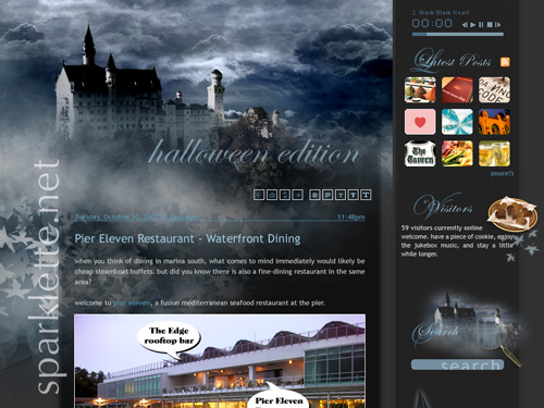
This being Halloween and all, I thought it would be fun to do up a Halloween edition of Sparklette. You know, transform the usual purple layout into something spooky.
So, I came up with this:
Click to enlarge
Welcome to the dark side! We have spooky storm clouds! Spooky mist! Even the dreamy neuschwanstein castle has turned spooky. I was going for the whole haunted castle look! Be sure to view it in full size!
I meant to use the black layout for this whole Halloween week, I really did. But time wasn’t on my side. I had just enough time to design the piece but not enough to actually implement it on the blog.
Personally, I really like how this whole thing turned out and thought it would be quite a waste if you guys didn’t get to see it. So, there you go! Meanwhile, I’ll just settle for wearing a black witch’s pointed hat.
Happy Halloween!
November 10, 2008: I made this into a usable theme after all! Check out the shiny new style switcher.


Nov 1, 2007
10
nooo….. i missed the spooky ! damn.. judging by the screenshot, it must’ve been spooooky :D
Nov 1, 2007
14
Damn nice! :)
Nov 1, 2007
42
Beautiful transformation! That castle sure does look creepy! :D!
I would’ve replaced the cookies in the Vistors thing on the side with maybe spiders or bugs or something. ^____^!
Good job. :D
Nov 1, 2007
3472
qureyoon: Boo!
Paddy Tan: Thanks! Wish I could have used this layout for real!
Mandy: lol spiders and bugs! I had thought to put up candy corn actually.
Nov 1, 2007
15
Wow. That’s very nicely designed. Would’ve been really great if you had managed to implement it on your blog.
Thanks for the spooky holiday-themed Ping.sg logo too!
Nov 1, 2007
1
It’s a pity you didn’t implement it – looks awesome :D
Can I say I prefer the Halloween look over the current pinkish one? :P
Nov 1, 2007
3472
uzyn: No problem. I always have fun designing logos for Ping.sg :)
Roys: Haha here comes that pink vs. purple debate again. For the record, sparklette.net is purple!
Nov 2, 2007
90
Looks nice. Too bad i missed it too.
Nov 2, 2007
1
Nice Design Veron! If only I am better at designing =(
Nov 2, 2007
6
Oops. I … must remember … sparklette.net is .. purple :D
Nov 3, 2007
1
I happen to think the black design actually looks better than the usual purple one, but that’s just me…
Nov 5, 2007
4
me too actually..i find the black one cooler,although the purple one is also nice in its own way =) you are really a great designer,keep up the good work!
Nov 8, 2007
3472
Thanks damien. Looks like you guys like the black more than the current purple. Can’t say I blame ya!