New Starbucks Logo – Love It Or Loathe It? Plus, a Look at the Logos Over the Years
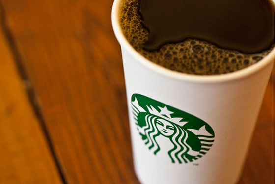
Starbucks announced a logo change this past week, eliminating the words “Starbucks” and “Coffee”, and the two stars that encircle its twin-tailed siren mascot. The siren has been enlarged to fill the whole logo and is now green instead of green and black.


How do you find the new Starbucks logo?
Some people have speculated that this is a strategic move by the Seattle company to gain a bigger share of the Asian market. By dropping the English words and making the logo more symbolic, it would appeal to people in non-English speaking countries.
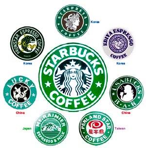
Over the years, many coffee chains in China, Taiwan, Japan and Korea have been using logos that closely resemble the distinctive trademark of the coffee giant. The latest logo update certainly makes it less easy to copy.
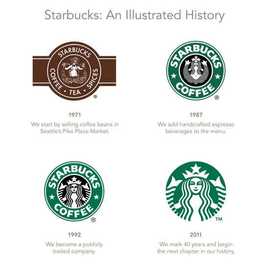
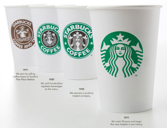
Here’s a look at the Starbucks logo over the years since 1971.


As a designer, I grow fonder of the new logo each time I look it. It is simpler, cleaner and more iconic. These days, Starbucks does not sell just coffee. The new logo would allow the company the flexibility of expanding into non-coffee markets.
What do you think of the new Starbucks logo? Do you love it or loathe it? Share your thoughts with us in the comments!

Jan 14, 2011
https://sparklette.net/wp-content/themes/v3195
New Starbucks Logo – Love It Or Loathe It? Plus, a Look at the Logos Over the Years on Sparklette.net http://sparklette.net/food/foodbytes/sta…
Jan 14, 2011
https://sparklette.net/wp-content/themes/v335
RT @Sparklette: New Starbucks Logo – Love It Or Loathe It? Plus, a Look at the Logos Over the Years on Sparklette.net http://sparklette.net/food/foodbytes/sta…
Jan 14, 2011
7
It feels empty without a border.
Jan 17, 2011
1
I agree! I think that’s the main thing that I don’t like about the new logo compared to the older one – it looks unfinished to me.
Jan 14, 2011
1
Love the new starbucks logo. Taking the fact that they are now more than a coffee company. So Starbucks Coffee doesnt make sense anymore.
And as you said, they can capture more non-english speaking markets.
Jan 23, 2011
1
I like it. Took me a few minutes. Even though I have my fair share of now soon to be “classic” logo items, the new brings more of a “universal” icon that may be more accepted internationally sans text…al la Apple Inc. That took me a while too, but it made great sense in retrospect. We are becoming a pictogram society.
Jan 23, 2011
3472
Paul, I think you hit the nail right on the head. The old Apple logo had text, too. Without the text, it looks more contemporary.
Jan 27, 2011
13
I think this is a strategically good move. The starbucks brand is so big and powerful now that the name isn’t really necessary. People can look at the logo and already know that it is Starbucks.
Jan 27, 2011
1
well i like the old one. i liked it with the frame. the new one is just way too new. it looks more plane and simple. it will take me a while to get used to it
Jan 29, 2011
1
The new design needs to have STARBUCKS but not the word “coffee.”
Feb 6, 2011
1
Generally, I am AOK with new logo. But it doesn’t do anything for me either. What to change?
This logo was a chance to do a bit more… since the bare breasted siren became more of a sea nimph, with clothes.. the next step (since starbucks wants to highlight her as the image of their company) is to reveal her hands.
Revealing her hands would open up the logo and make it inviting, especially if they moved both hands to open in from of her, umm, tail, And they could also lose what is left of her tail… not really needed at that point. But then you have an inviting sea miss who is beconning and welcoming. Much nicer than the “hidden hands” portrait we have here. (“hidden hands being universally understood as a sly, untrustworthy gesture that screams, “we are hidding something” … like our obscene profits. :) I love Starbucks, but the logo needs immediate adjustment if they are going to go with our Sea Princess image. )
As for the name… add it or no, that is not the major concern. But if you add it to the above adjusted image, I would definitely declutter by remove what is left of her tail.
Mar 9, 2011
1
YUK! PLEASE, PLEASE RETURN TO THE 1992 VERSION. Starbucks get real and don’t mess with perfection. It’s an American Icon around the world over like McDonalds, Coca Cola, and Pepsi Cola!
However now the symbol can mean anything in any language, it’s not an American symbol but a Universal symbol for anything Starbucks wants to represent. Notice the word coffee missing from the Logo.
Mar 22, 2011
1
It looks incomplete