Ping.sg Holiday Logos
Besides Sparklette, another website that I’m involved in is popular community metablog, ping.sg. U-Zyn, the brain behind this project, invited me to redesign the website in late ’06.
We also thought that as with every great website, it deserves its own customised logos during special occasions, like google’s. So during Christmas ’06, the first ever holiday logo was created for Ping.sg. It was very well-received and spurred me to create a whole series of holiday logos.
All of these are based on the original blue “ping” logo. Here they are, all in one place! This post would be continually updated as more logos are created. So do bookmark this page and check back for new logos!
Chinese New Year 2009:

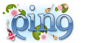
I experimented with changing the background colour of the logo. So it appears as though koi fish are swimming in a blue pond, with pink waterlilies afloat.
Deepavali 2008:

There aren’t too many opportunities when I can take my chances with a purple logo. Deepavali (diwali) just happens to be one of them. This being the festival of light, I added Indian lamps, while the colourful peacock feather lends a dash of colour.
Mother’s Day 2008:

Mother’s day falls on May 11 for 2008. On this wonderful and meaningful day, I create this logo just for her. I attempt to keep things simple by colouring it in pink and adding just a single stalk of richly-detailed rosebud (you can even see the water droplets). I really like how things turned out.
Labor Day 2008:

Labor day! In Singapore, this falls on the first day of may each year. Working people get the day off on this rather ironically named day. An axe, a hammer and a screwdriver symbolise the tools that labourers may use. Then, there’s the workman wearing his hardhat, with a traffic cone and a stop sign.
Valentine’s Day 2008:

I have been waiting for a chance to use my favourite colour. That chance came when valentine’s day arrived, probably the only time when a purple logo would be appropriate! Cuddly teddy bears and gifts are things that this day can’t go without. A big heart glows in pink to remind us all that the most important element of this day is still love.
Chinese New Year 2008:

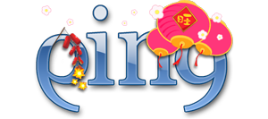
As Chinese New Year coincides with spring, pink spring blossoms are featured here. Dangling from the top are chinese lanterns in bright pink. Look out for those firecrackers – they are lit!
Christmas 2007:

It’s always fun designing stuff for Christmas. I gave the logo an icy, translucent effect (note how the candy cane can be seen through the ice) and dotted the “i” with a snowflake. In the foreground are a bunch of colourful gift boxes and Christmas baubles. As a finishing touch, I let the “g” wear a woolly Santa hat!
Hari Raya Haji 2007:

For Hari Raya haji, the logo has turned green, a prominent festive colour. In addition to that, I have also painted it over with a faint paisley design. This is the first time I have experimented with patterns in this logo series. ketupats (malay rice cakes) dangle from the logo. Once again, I made use of the dot in the “i”, replacing it with the islamic symbol.
Halloween 2007:

This spooky logo designed for Halloween 2007 is another of my favourites! Like the valentine’s day 2007 logo, I have tweaked the logo colour to black. bats fly around it while a black cat arches its back. Also present are two jack-o-lanterns, an important Halloween element. Try spotting the little ghost!
Mid-Autumn Festival 2007:

The Mid-Autumn Festival is also known as the Moon Festival. On this day, the full moon is significantly bright. Besides having the full moon in this logo, I have also hanged a couple of brightly coloured paper lanterns. At night children would go out in the dark carrying such lanterns.
Valentine’s Day 2007:

Ping.sg has gone pink! To celebrate valentine’s day, I coloured the logo pink and scattered red hearts in various sizes all over. A paper cutout couple in baby blue and pink stands hand in hand, deeply in love.
Chinese New Year 2007:

As a kid, I would play with small firecrackers during Chinese New Year when visiting relatives in Malaysia (it’s legal there). Similarly in this logo, a little girl dressed in red sets a firecracker alight. Also present are common Chinese New Year items such as the chinese “fu” (?, fortune) character (hung upside down to signify that fortune has arrived) and mandarin oranges.
New Year 2007:

Right after Christmas, I designed a logo for new year 2007. This time round, I went for a celebratory theme. The things you would usually see at a new year’s party can be found here, such as colourful balloons, confetti, wine and some bubbly, of course.
I created this logo for Christmas 2006 shortly after I joined the team. snowflakes fall and accumulate on the logo. A yellow glowing star is used to dot the “i” while a Christmas wreath hangs on the “n”. To add a touch of cute, I brought in frosty the snowman to wave hi! To date, this remains my most favourite Ping.sg holiday logo.
Personally I prefer the logos that retain the original blue, with additional little elements used sparingly. Simplicity is key. With such little screen estate to work with, it’s best not to incorporate both colour changes and several elements into one logo (Christmas 2007, valentine’s day 2008).
It also helps that the original logo looks visually balanced (the “p” and “g” are flipped characters), which makes designing on top of it that much easier. I do get some help from icon and clipart resources and wouldn’t dare take full credit for all of them.
So what do you think? Let me know which one is your favourite!


Apr 30, 2008
4
Cool, nice logos design you have. Your design skills are great. :)
Apr 30, 2008
3472
Thanks! It’s really fun designing these logos too :)
Apr 30, 2008
10
i always
May 1, 2008
90
I love all of them. Agree on keeping the blue colour intact.
May 1, 2008
3
love yr chinese theme ones esp cny 07! :)
May 1, 2008
1
I prefer the colour changes. It makes it more distinctive, and feels more “special.” Otherwise, it feels like stuff tacked onto the logo. The Hari Raya one is gorgeous.
May 1, 2008
2
Yeah, the change of colour sure gives it a more different look. (Like best the ones for Valentine’s Day 2008 & Halloween 2007).
Ever try to experiment with different type of font for “PING”? =)
May 1, 2008
41
the logos are so lovely!
really great to see the different logos at ping.sg!
May 1, 2008
1
Nice collection, i wonder how Singapores logo for a local Mardi Gras would look like :))
May 1, 2008
1
Looks really good! For a moment I thought I was Sabrina’s blog, because of the header. Very professional and gorgeous! A good job well done, if only I have half your flair in designng.
May 1, 2008
3472
sylv: You always…?
Miccheng: Thanks! We think alike!
QuaChee: The little girl sitting on the logo sure made that a popular one :)
nocturne: Good to know that someone likes the colour changes! It was definitely a fun experience doing the Hari Raya logo, especially with the paisley pattern.
a_x: That’s a great idea! I tend to retain the original “ping” font so as not to sway too much from its identity, especially after all the holiday-themed changes. But it sure would be challenging to experiment with a different font next time.
chillycraps: Love spicing things up and making it all festive!
AngryAngMo: It would be glitzy and very colourful, probably with masquerade masks and all. Sounds fun to do!
Darran: Thanks! Sabrina based her blog design on mine, hence explaining the similarity.
May 1, 2008
5
Hey Veron. I think I can ever design anything like those. They have a nice female touch.
Where do you get the icons and cliparts? Yours look so much better and cuter than those I usually find in iStockPhoto. I need some new places to look for icons.
May 1, 2008
6
my fave has to be the halloween 2007’s logo! love the cute kitty on the ping.sg logo!
May 1, 2008
15
It’s always a pleasure and full of surprises receiving holiday logos from you. Your logo really enhances the holiday mood of Ping.sg during those seasons.
Thanks Veron for spicing up the site. :)
May 1, 2008
4
I like the Haloween logo!
May 1, 2008
10
how come my comment got cut? =/
i said i always love your logos.. and i like the autumn festival one!
May 1, 2008
3472
Aen: Thanks! I visit pixelgirl for icons. They have a large collection of icons made for Mac, and Mac icons are some of the most detailed and best-looking ones around.
nadnut: Meow!
uzyn: I love doing these logos! Very happy that I can use ping.sg as a platform to churn out new holiday logos regularly. Sometimes I myself get surprised by the final outcome too.
peewee: Thanks for sharing!
sylv: Not sure what happened. But thanks! I like the moon in that one. Initially this logo was meant to have a black nightsky as part of the background, but I couldn’t get it to work!
May 2, 2008
10
ooo, so it’s you who did the logo ? no wonder have a ‘girly girly’ feeling in it :P
but beautiful design as always ;)
maybe you can experiment with a design that looks more BOYish :P
hehehe…
have a nice weekend gurl ^^
May 2, 2008
3472
Haha a more boyish design? Do the tools in the latest Labor Day logo count? Tools are pretty manly, no?
Would keep this in mind, and try to man up some of my future logos. Thanks!