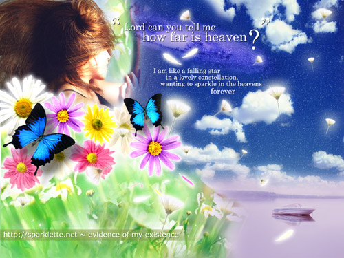
Version 1.10: How Far is Heaven?
Having procrastinated for so long, I finally decided to upload this new layout. I finished this over a month ago but had been too lazy and tied up with work to get it up. But anyway here it is – version 10 of Sparklette, titled “how far is heaven?“.
Some lyrics featured come from the song “heaven” by the los lonely boys. I love that song a lot. It’s sad, yet joyful at the same time. The person lying down on the meadow is yours truly. This picture was taken from one of my modelling shoots by photographer, adam.
The colourful flowers up there are daisies. They are my second most favourite flowers (after the oriental lily of course, which has already been used in the previous layout).
I hope you guys like this layout. I used more colours in this than any of my previous layouts, so it’s something a little different.
Much love,
Veron


Jun 28, 2005
*meow meow* (read: i like)
Jun 28, 2005
3472
thanks :)
Jun 28, 2005
hey babe… layout looks great.. Anything purple is superb to me anyway haha..
But I think your layout isnt showing in my Firefox properly.. The part "the girl", its text is extending way outside the box and theres this wierd grey border on the left of the text.
I like the huge-ass icons on each secton on the side bar.. hahaha… The drop down menus looks v sleek on the sidebar too. But The long list of food (you’re killing me by the way – so mouthwatering haha) and shows is a bit cluttery – im not sure of any other way to list it tho..
I’m not too fond of the mix of colours, its a bit unbalanced – the top left is very rainbow, but then again very blue – then the main page is very purple.. But it does give the desired effect – a collage of colours and vibrancy, if thats wad ure aiming for.
Cheers babe…
Jun 28, 2005
oops… I know wads wrong… the main page in Firefox shows as purple instead of green cuz it cant do transparency I guess?
Jun 28, 2005
absolutely beautiful. your best layout so far.
perhaps you can change the title of the page from “i fade away on the street of broken dreams” to “How far is heaven?”
Haha… it’s very nice. colourful and all! It’s beautiful!
Jun 28, 2005
3472
hey voed, thanks for the super long feedback.
i haven’t tested this on any other browser yet, so i have no idea if it’s showing properly on firefox or netscape. yeah but come to think of it, i should probably do that.
i agree with you on the food part; i think there are too many details and i shortened the line-height in the stylesheet. can be easily fixed:P.
yup i was aiming for a whole bunch of colours in this layout, as vibrant as possible. it’s my idea of heaven anyway haha
thanks again for all the feedback!
Jun 28, 2005
3472
alwyn, i got it fixed! forgot all about the title part haha… thanks.
Jun 28, 2005
42
I ABSOLUTELY LOVE IT!!! It’s so bright and cheery and original, all your layouts are original in my opinion. Tis why I love your site so much.
But yeah, this iframe isn’t transparent in Firefox and for some reason it’s lagging really bad as I type my comment. I think it’s the comment boxes and smilies cause that’s the only part of the page that slows down as I scroll.
Btw, wooo for painting room, that was quick and I’m impressed. I’m suppose to have moved my room into the larger one right next to it and I can’t even get myself out this chair XD
Good job :)
Jun 28, 2005
3472
hello mandy, as usual, thanks for your wonderful input. i actually do encounter the same lag whenever i hit the comments page. i have removed any running scripts and the smilies already. still, it’s lagging a little and driving me insane. i have no idea what’s causing it really. but i shall just leave it alone for now.
Jun 29, 2005
Very pretty.. I love it :)
Jun 29, 2005
this layout looks perfect!
Jul 2, 2005
Da wallpaper ROXS. Constellation of vibrant colours spiltting into a magnificient supernova.
Jul 2, 2005
3472
wow thanks, K’. and who is this again?
Jul 3, 2005
im merely a blogder of ur blog.. although we noe each other in real life ;)
Jul 2, 2006
1
hey, i really like your website, its so pretty:). well i was wondering that since its close to summer, if you can make a layout that is colourful and summer themed. Cause lately, i have had no ideas for my piczo site. By the way, your really pretty.
Jul 3, 2006
3472
hey ashley, one of my previous layouts actually had a summer theme! i’m too lazy to put up the past layouts page, but if you are interested you can see that summer layout over here.
Oct 24, 2008
1
hi there..nice blog..hv a nice day :)