sparklette.net – Layouts from Past to Present
Did you know that this purple castle layout is actually version 11 of Sparklette? There are 10 other layouts I have used previously that most of you may not be aware of.
After being awarded “best blog design” at Ping.sg, I think it’s finally time for me to do a quick recap of all the different designs that Sparklette has sported since 2002!
Each and every design bears several personal elements to it, be it relating to my favourite things or the state of mind I was in as I designed a layout at that particular point in time.
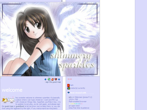
Spanned: November 29, 2002 – January 12, 2003
Lifespan: 1 month 14 days
When I first started this website in late 2002, the world had only just seen the dawning of the blog craze. At that time, I started this site not really to blog, but mainly because I needed something to design.
In version 1 (titled “angel wings”), I used a cartoonish image of rinoa heartilly, a female character from my favourite RPG, final fantasy VIII. It became the first out of a few other purple layouts that I did subsequently.
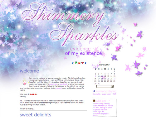
Spanned: January 12, 2003 – April 10, 2003
Lifespan: 2 months 29 days
I created version 2 (titled “autumn sonata”) from scratch. It was made up of maple leaves in different hues of purple, blue and green, littered with white orbs flying all over the place like “shimmering sparkles”. In fact, I liked those leaves so much I brought them back to this current castle layout!
In versions 1 and 2, I did not use any engine to create my blog entries. Every single blog post was painstakingly coded with love, and then copied and pasted into monthly archive pages. Why? Because I was a control freak and didn’t want to use blogspot or diaryland (the two most popular blogging platforms at that time) like everyone else.
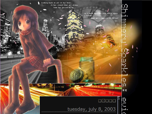
Spanned: April 10, 2003 – July 10, 2003
Lifespan: 3 months
Eventually, the manual hard labour got too tiresome. I finally decided to use a blogging engine called “greymatter” as I rolled out version 3 (titled “passed me by”).
At that time, I was feeling lost. My feelings were depicted by the anime image of a girl sitting in a playground, against a black and white cityscape. The giant clock in the background represented how the world was always busy and constantly passing me by.
The butterfly that had been emancipated from a glass jar and flying towards daylight represented how trapped I felt and how I longed to be free.
It was a pretty dark layout, hence black was the choice of colour.
The words seen in the design:
“looking back on all it has been,
It has seemed that all along,
Time has passed me by…
As I walk into the real world again
I wonder…
What am I supposed to do now?”
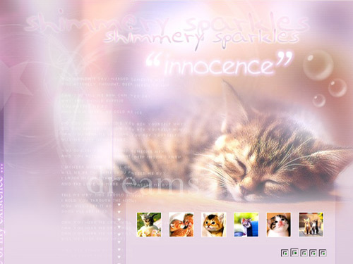
Spanned: July 10, 2003 – November 22, 2003
Lifespan: 4 months 12 days
You know it had to happen! Sooner or later I had to feature my favourite animal in my blog layout! It came in version 4 (titled “innocence”) where I used a kitty theme!
The main image was one of a sleeping kitten. It was very innocent, sweet and adorable. The lyrics featured in the background was from the song “hear me cry” by Japanese band, cagnet.
What goes with innocence? Pink, of course!
Spanned: November 22, 2003 – March 12, 2004
Lifespan: 3 months 20 days
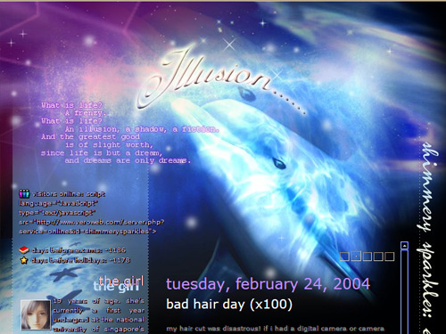
My love for Northern lights was depicted in version 5, “illusion”. The illusion I wanted to create was of a dolphin seemingly swimming in the heavens, complete with stars and Northern lights.
The words seen in the design:
“What is life? A frenzy.
What is life? An illusion, a shadow, a fiction.
And the greatest good is of slight worth,
Since life is but a dream, and dreams are only dreams.”
Spanned: March 12, 2004 – June 16, 2004
Lifespan: 3 months 4 days
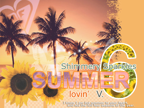
For the first time, I experimented with using a bright colour scheme in my design. It was a flop initially because I made the mistake of creating the layout solely on my laptop, without double-checking to see if the colours looked fine on a desktop computer. They didn’t, and many of my readers complained of being blinded by the brightness!
I fixed the colours and the resultant summery theme had cheery colours, with palm trees, sunflowers and even a pink roxy logo in the background (I was never sued).
The words seen in the design:
“I know I am but summer to your heart,
And not the full four seasons of the year.”
Spanned: June 16, 2004 – October 24, 2004
Lifespan: 4 months 8 days
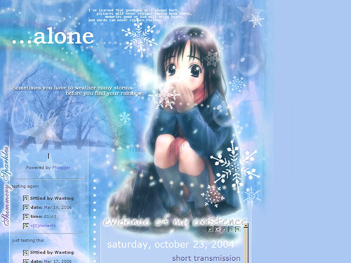
Version 7 (titled “alone”) had more of a moody and cold feel to it. I used yet another anime image of a girl sitting alone in winter with snowflakes whirling around.
The words seen in the design:
“I’ve learned that goodbyes will always hurt, pictures will never replace having been there, memories good or bad will bring tears, and words can never replace feeling.”
“Sometimes you have to weather many storms before you find your rainbow.”
Did you spot the faint rainbow in the background?
Spanned: October 24, 2004 – January 30, 2005
Lifespan: 3 months 6 days
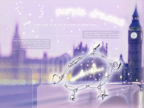
My love for london (although I’ve never been there) and travel propelled me to feature big Ben in version 8, “purple dreams”.
The numerous stars in the purple sky include the orion constellation. I created an animated gif so that the stars in the orion actually twinkled! The silver bracelet is a piece of jewellery I own from tiffany & co.
The words seen in the design:
“I can’t wait all my life on a street of broken dreams.”
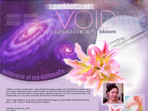
Spanned: January 30, 2005 – June 28, 2005
Lifespan: 4 months 28 days
Version 9 (titled “void”) has somewhat of a sci-fi/astronomy theme, with swirling galaxies and a space observatory. The pink flowers featured are oriental lilies, my favourite flowers.
This is one of my few most favourite layouts to date.
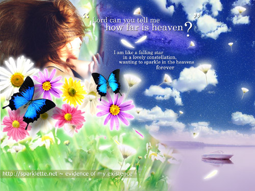
Spanned: June 28, 2005 – May 17, 2006
Lifespan: 11 months 19 days
For the first time, I used my own photograph in a layout. I distinctly remember putting more thought and effort in this design than ever before. It was also the most colourful.
I was looking to create a scene from what my idea of heaven would be. Hence, this piece was titled “how far is heaven?”, also from the song “heaven” by the los lonely boys.
So, my idea of heaven has a clear blue sky with fluffy white clouds and millions of tiny stars. The outer space is also clear and visible, evident from the galaxy in the sky.
Dandelions and flower petals would float everywhere, and everything would look beautiful. There would be colourful daisies too, my second most favourite flower (after the oriental lilies).
Finally, there would be peace, as represented by the tranquil scene of a white boat on a calm purple lake.
The words seen in the design:
“I am like a falling star in a lovely constellation,
Wanting to sparkle in the heavens
Forever.”
Ta-da! There you go! All the ten different looks of Sparklette since 2002! My personal favourite is version 10, although I do love this current castle/fairy tale layout too.
Tell me which one is your favourite!
Much love,
Veron

Jul 15, 2007
3472
Thanks Mandy! Among all my readers, you are probably the one who’s visited my blog for the longest time!
I love the fact that you could relate to that dolphin layout! I don’t think you’ve ever shared that little anecdote with me before.
Thanks! It means a lot!
Jul 15, 2007
12
Leaving the current version out, I liked version 3 followed by version 10. The hope in the darkness – walking from the darkness into the light or is it walking from the light into the darkness? As for version 10, I like dandelions so it gets my vote. Have you tried taking a photo of a dandelion from another different angle? The result can be quite stunning…try it when you see one the next time in the fields. You will need to move quite close in =)
Jul 15, 2007
3472
Version 3 is a hawt favourite with the guys!
And I don’t think I’ve ever seen dandelions in real life before! Very ashamed to say so. But I bet it would be a very pretty sight! When I die I want to be buried in a field with dandelions!
Jul 16, 2007
3
I’ll vote for version 10. The colour combination is superb!
Jul 16, 2007
2
Wow…can see the big improvement! Your current website really captured my attention since last year as i accidentally entered your blog while i was searching Giraffe restaurant (singapore) url via yahoo. It’s really impressive & really love your maple leaves! I used to check out your blog regulary but this is my 1st msg here. Very pleasure..Awaiting more & more impress work from your blog!! Keep it up ya ;-)
Jul 16, 2007
41
eek, looks like I’ve missed out so many kawaii girls!!
Jul 16, 2007
90
Can see how you’ve grown and improved through the years. Thanks for sharing this with us. ^_^
I love all the designs. I see that you used visual cues from design 2 for your current design – a vast improvement. I can see u put a lot of love into all your designs, and how proud you are of them. Ha ha… lesson learnt – laptop screens are not suited for designers.
I wouldn’t want to show my early works – i cringe to see how juvenile those designs look (circa late-1990s). :D
Great on ya babe!
Jul 16, 2007
3472
hendri: Yay! That’s my most favourite!
jceleste: Thanks for your wonderful words, and for finally leaving a message!
chillycraps: Haha you are so cute!
Miccheng: I bet this is your first time seeing these! Yep, they’re my babies and I’m proud of (almost) every one of them! The first website I designed was in the late 90s too. Like you, I cringe whenever I visualise how juvenile my earliest works were! But they were what sparked off the eventual (and hopefully) more decent pieces of work.
Jul 16, 2007
90
All 11 designs together – yes, this would be he first time. :D
Don’t get complacent – the best is yet to be. ^_^
Jul 16, 2007
6
Hmmm… Based on my preference…
1st Place is, most definitely, Version 1: Only in Fairy Tales… – It’s my absolute favorite! The best of the best! It’s simply PERFECT!
2nd Place is Version 10: How Far is Heaven? – I like this one too, very original, superb colour combination. In fact it may be a better design then Version 11. However, I prefer a “fastasy” kinda look so it’s still 2nd place… ;x
3rd Place is Version 8: Purple Dreams – Very dreamy but the words are a little too faded…
4th Place is Version 2: Autumn Sonata – This looks simple yet soothing. Not to complicated.
5th Place is Version 6: Summer Lovin’ – It blends well, but the colours aren’t so ideal. Perhaps I just don’t like orange. LoLx~
Honestly speaking the last 2 layouts are much better illustrated. The previous ones are a little “blogskin-like”. No offense.
Jul 16, 2007
27
Ooh wow! I think I was around since layout 6.
I think I like version 11 the best though. :)
Congratulations on your win!
Jul 16, 2007
1
current design is the best so far (:
thumbs up! jiayou
Jul 16, 2007
38
wow… all your previous designs are really good! i are seriously impressed
Jul 16, 2007
11
Hey! I remembered seeing Version 3 before! I was so so so captivated by that layout design back then, didn’t know it was yours! Haha. I used the little girl in Version 7 as one of my old layouts too. Hah! Anyway, Version 8 is one of my favourites! I just love how your layout looks, really purplish and dreamy. Gahhh, I know this is a little late, but congrats on winning the title of best blog design! (I signed up just so that I could vote. =X) And, I love Version 4 too! Such an adorable kitten! :D
Hmm, just a little curious. Before you had sparklette.net, where were you (hosted at)?
Jul 16, 2007
4
i like 3 6 7 8 9! i like the way you design your layout with the perfect choice of quotes for that theme.
Jul 17, 2007
9
Hey hi Veron! wow.. indeed talented!! I can’t even use photoshop to draw a perfect circle!
Anyway, I like version 10. Find the pictures all blended in beautifully. And the little phrase/poem is the topping on the ice-cream… well done!
Jul 18, 2007
3472
Miccheng: “The best is yet to be.” That line holds special meaning for me. It’s the school motto back when I was in ACJC!
princess: Thanks for all your feedback and careful analysis! I’m glad that my designs have improved over the years. Versions 10 and 11 are my most favourite too!
Jasmine: Wow you have been visiting this blog since 2004! That’s a really long time! Thanks!
lynn: Thanks!
merv: That’s very flattering and encouraging. Thanks Merv!
Huimei: Oh! A nice lady blogger hosted me for free at her domain, little-happiness.net (before I bought sparklette.net). It’s no longer around though.
my: Hey babe, I remember each time I uploaded a new design, you would tell me you like it better than the previous one! You were so supportive!
Kev: Yeah! I love having those little quotes and poems around in my layout. They express my sentiments very well.
Jul 18, 2007
14
whoa!! all your designs are so pretty and nice. I love pass me by, alone and your current one the most. Keep it up!! really cool!!!
Jul 18, 2007
1
What castle is it in the masthead? Where did the picture come from?
Jul 18, 2007
11
woah!really nice design!!
you know jack neo..he got a blog and said looking people help him to design for his blog..
maybe you can help him to design for his blog :)
this is his blog address..
http://jackneojackneo.blogspot.com/