sparklette.net – Layouts from Past to Present
Did you know that this purple castle layout is actually version 11 of Sparklette? There are 10 other layouts I have used previously that most of you may not be aware of.
After being awarded “best blog design” at Ping.sg, I think it’s finally time for me to do a quick recap of all the different designs that Sparklette has sported since 2002!
Each and every design bears several personal elements to it, be it relating to my favourite things or the state of mind I was in as I designed a layout at that particular point in time.
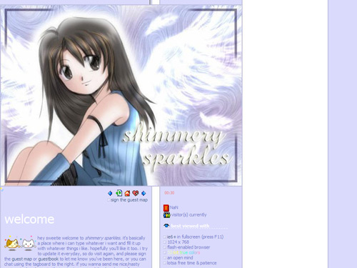
Spanned: November 29, 2002 – January 12, 2003
Lifespan: 1 month 14 days
When I first started this website in late 2002, the world had only just seen the dawning of the blog craze. At that time, I started this site not really to blog, but mainly because I needed something to design.
In version 1 (titled “angel wings”), I used a cartoonish image of rinoa heartilly, a female character from my favourite RPG, final fantasy VIII. It became the first out of a few other purple layouts that I did subsequently.
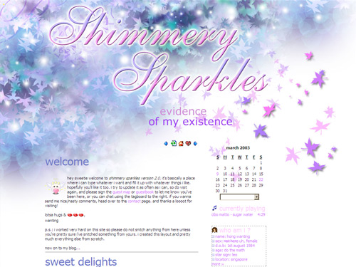
Spanned: January 12, 2003 – April 10, 2003
Lifespan: 2 months 29 days
I created version 2 (titled “autumn sonata”) from scratch. It was made up of maple leaves in different hues of purple, blue and green, littered with white orbs flying all over the place like “shimmering sparkles”. In fact, I liked those leaves so much I brought them back to this current castle layout!
In versions 1 and 2, I did not use any engine to create my blog entries. Every single blog post was painstakingly coded with love, and then copied and pasted into monthly archive pages. Why? Because I was a control freak and didn’t want to use blogspot or diaryland (the two most popular blogging platforms at that time) like everyone else.
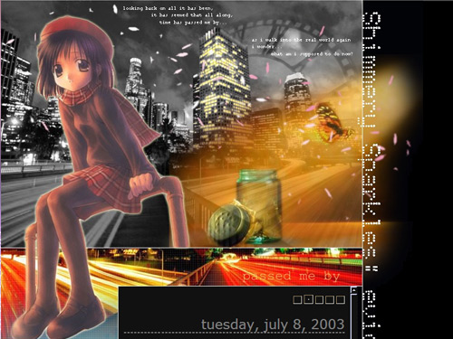
Spanned: April 10, 2003 – July 10, 2003
Lifespan: 3 months
Eventually, the manual hard labour got too tiresome. I finally decided to use a blogging engine called “greymatter” as I rolled out version 3 (titled “passed me by”).
At that time, I was feeling lost. My feelings were depicted by the anime image of a girl sitting in a playground, against a black and white cityscape. The giant clock in the background represented how the world was always busy and constantly passing me by.
The butterfly that had been emancipated from a glass jar and flying towards daylight represented how trapped I felt and how I longed to be free.
It was a pretty dark layout, hence black was the choice of colour.
The words seen in the design:
“looking back on all it has been,
It has seemed that all along,
Time has passed me by…
As I walk into the real world again
I wonder…
What am I supposed to do now?”
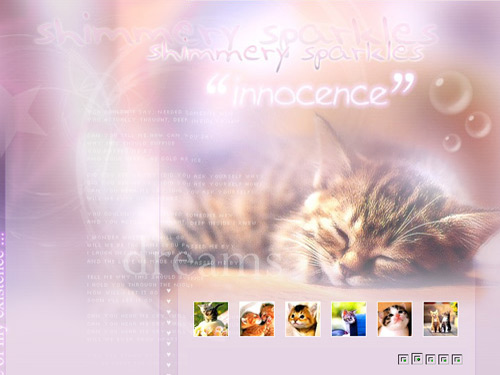
Spanned: July 10, 2003 – November 22, 2003
Lifespan: 4 months 12 days
You know it had to happen! Sooner or later I had to feature my favourite animal in my blog layout! It came in version 4 (titled “innocence”) where I used a kitty theme!
The main image was one of a sleeping kitten. It was very innocent, sweet and adorable. The lyrics featured in the background was from the song “hear me cry” by Japanese band, cagnet.
What goes with innocence? Pink, of course!
Spanned: November 22, 2003 – March 12, 2004
Lifespan: 3 months 20 days
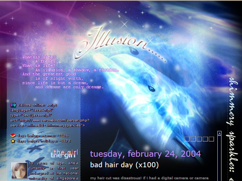
My love for Northern lights was depicted in version 5, “illusion”. The illusion I wanted to create was of a dolphin seemingly swimming in the heavens, complete with stars and Northern lights.
The words seen in the design:
“What is life? A frenzy.
What is life? An illusion, a shadow, a fiction.
And the greatest good is of slight worth,
Since life is but a dream, and dreams are only dreams.”
Spanned: March 12, 2004 – June 16, 2004
Lifespan: 3 months 4 days
For the first time, I experimented with using a bright colour scheme in my design. It was a flop initially because I made the mistake of creating the layout solely on my laptop, without double-checking to see if the colours looked fine on a desktop computer. They didn’t, and many of my readers complained of being blinded by the brightness!
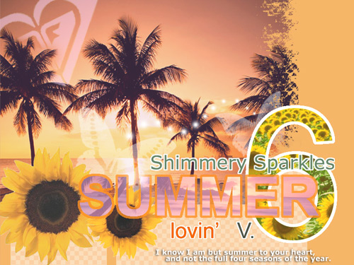
I fixed the colours and the resultant summery theme had cheery colours, with palm trees, sunflowers and even a pink roxy logo in the background (I was never sued).
The words seen in the design:
“I know I am but summer to your heart,
And not the full four seasons of the year.”
Spanned: June 16, 2004 – October 24, 2004
Lifespan: 4 months 8 days
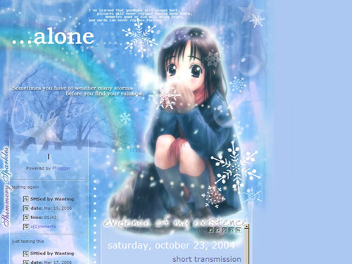
Version 7 (titled “alone”) had more of a moody and cold feel to it. I used yet another anime image of a girl sitting alone in winter with snowflakes whirling around.
The words seen in the design:
“I’ve learned that goodbyes will always hurt, pictures will never replace having been there, memories good or bad will bring tears, and words can never replace feeling.”
“Sometimes you have to weather many storms before you find your rainbow.”
Did you spot the faint rainbow in the background?
Spanned: October 24, 2004 – January 30, 2005
Lifespan: 3 months 6 days
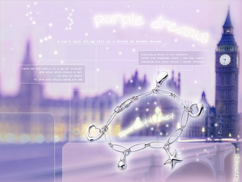
My love for london (although I’ve never been there) and travel propelled me to feature big Ben in version 8, “purple dreams”.
The numerous stars in the purple sky include the orion constellation. I created an animated gif so that the stars in the orion actually twinkled! The silver bracelet is a piece of jewellery I own from tiffany & co.
The words seen in the design:
“I can’t wait all my life on a street of broken dreams.”
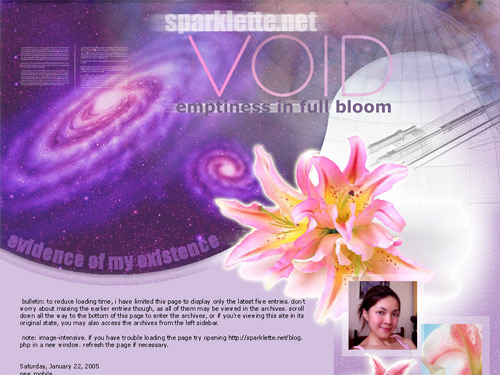
Spanned: January 30, 2005 – June 28, 2005
Lifespan: 4 months 28 days
Version 9 (titled “void”) has somewhat of a sci-fi/astronomy theme, with swirling galaxies and a space observatory. The pink flowers featured are oriental lilies, my favourite flowers.
This is one of my few most favourite layouts to date.
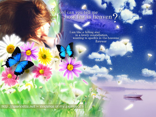
Spanned: June 28, 2005 – May 17, 2006
Lifespan: 11 months 19 days
For the first time, I used my own photograph in a layout. I distinctly remember putting more thought and effort in this design than ever before. It was also the most colourful.
I was looking to create a scene from what my idea of heaven would be. Hence, this piece was titled “how far is heaven?”, also from the song “heaven” by the los lonely boys.
So, my idea of heaven has a clear blue sky with fluffy white clouds and millions of tiny stars. The outer space is also clear and visible, evident from the galaxy in the sky.
Dandelions and flower petals would float everywhere, and everything would look beautiful. There would be colourful daisies too, my second most favourite flower (after the oriental lilies).
Finally, there would be peace, as represented by the tranquil scene of a white boat on a calm purple lake.
The words seen in the design:
“I am like a falling star in a lovely constellation,
Wanting to sparkle in the heavens
Forever.”
Ta-da! There you go! All the ten different looks of Sparklette since 2002! My personal favourite is version 10, although I do love this current castle/fairy tale layout too.
Tell me which one is your favourite!
Much love,
Veron

Jul 19, 2007
1
I’ve visited your site several times, always intrigued by the design, because it works, but it’s also so different than anything I would have thought to do. When I figure out exactly why I like it perhaps I’ll post again. In the meantime I’ll keep stopping by.
Jul 20, 2007
1
I simply love your designs. Also the poetic lines are really good.
Keep up the good work.
Jul 20, 2007
4
Ur designs are unique. Love the way u do those magical themes.
Jul 30, 2007
6
i like version 10 the most! :)
Jul 31, 2007
12
Hey girl,
You really evolve!
I love ‘Alone’, but please, no dolphins.
As they say in Japan, 都会人、貴方は定める!
Aug 5, 2007
2
nice design … love v11
Aug 30, 2007
27
Version 10! And then Version 8.
You are good, Veron. But then that goes without saying…
Love that photograph of yours on v10. Very nice. Must had been a good photographer.
Sep 13, 2007
10
definitely v11 ^^ unless there’ll be v12 ;P
your design from 1 to 10 is improving a lot ! i m v u :P
Oct 29, 2007
1
Just stopping by and must say from your works feel much tender and fantasy. Continue and enjoy your work =D..Romik
Oct 30, 2007
1
May I use version 10 or 3 as a layout for myspace? I need help.
Jan 21, 2008
1
:) i like this current background the best. (aka only in fairy tales) because it’s a nice shade of purple and i love how it’s soothing and calm. it’s very beautiful! GOOD JOB! =)
P.S. i have a question though. How do you manage to put the purple leaves onto the website? like… how do you manage to program them? the leaves are already there (right? so you didn’t have to program them yourself?) because i’m learning to program, and i find it rather fascinating… so i’ve already wondered about how it came to be. :) it would be great if you would email me back with the answer.
thanks. and once again, good job! i really like the bg
Jun 15, 2008
1
omg~
i just happened to find ur blog and i realli like all ur designs^^
nice work done~^^
must teach me how.. hehe ;p
Jun 25, 2008
1
aw do you want to do my blog design?
plzz x)
Jul 1, 2008
1
omg…
the layout is extremely beautiful! This current layout is so pretty, but my fave is the same as yours, which is verion 10…
Calm, and the starry sky part is absolutely beautiful ^^
Anyway, can you do a blog design? Is it for free anot?
Just asking ^^
Thx!
Aug 7, 2008
15
woah! I just found this page. All the designs looks really nice.
May I know what software you used to design your blog? >.<